Although \(F\)-statistics are widely used and very informative, they suffer from one fundamental limitation: We have to know what the populations are before we can estimate them.1 They are based on a conceptual model in which organisms occur in discrete populations, populations that are both (1) well mixed within themselves (so that we can regard our sample of individuals as a random sample from within each population) and (2) clearly distinct from others. What if we want to use the genetic data itself to help us figure out what the populations actually are? Can we do that?2
A little over 20 years ago a different approach to the analysis of genetic structure began to emerge: analysis of individual assignment. Although the implementation details get a little hairy,3 the basic idea is fairly simple. I’ll give an outline of the math in a moment, but let’s do this in words first. Suppose we have genetic data on a series of individuals at several to many (or very many) loci. If two individuals are part of the same population, we expect them to be more similar to one another than they are to individuals in other populations. So if we “cluster” individuals that are “genetically similar” to one another, those clusters should correspond to populations. Rather than pre-defining the populations, we will have allowed the data to tell us what the populations are.4 We haven’t even required a priori that individuals be grouped according to their geographic proximity. Instead, we can examine the clusters we find and see if they make any sense geographically.
Now for an outline of the math. Label the data we have for each individual \(x_i\). Suppose that all individuals belong to one of \(K\) populations5 and let the genotype frequencies in population \(k\) be represented by \(\gamma_k\). Then the likelihood that individual \(i\) comes from population \(k\) is just \[\mbox{P}(i|k) = \frac{\mbox{P}(x_i|\gamma_k)}{\sum_k \mbox{P}(x_i|\gamma_k)} \quad .\] So if we can specify prior probabilities for \(\gamma_k\), we can use Bayesian methods to estimate the posterior probability that individual \(i\) belongs to population \(k\), and we can associate that assignment with some measure of its reliability.6 Remember, though, that we’ve arrived at the assignment by assuming that there are \(K\) populations and that the genotype frequencies are in Hardy-Weinberg in all of those populations.7 Since we don’t know \(K\), we have to find a way of estimating it. Different choices of \(K\) may lead to different patterns of individual assignment, which complicates our interpretation of the results.8 We’ll discuss both of these challenges in a simple, but real, data set to illustrate the principles.
To see a simple example of how Structure
can be used, we’ll use it to assess whether cultivated genotypes of
Japanese barberry, Berberis thunbergii, contribute
to ongoing invasions in Connecticut and Massachusetts . The first
problem is to determine what \(K\) to
use, because \(K\) doesn’t necessarily
have to equal the number of populations we sample from. Some populations
may not be distinct from one another. There are a couple of ways to
estimate \(K\). The most
straightforward is to run the analysis for a range of plausible values,
repeat it 10-20 times for each value, calculate the mean “log
probability of the data” for each value of \(K\), and pick the value of \(K\) that is the biggest, i.e., the least
negative (Table 1). For the barberry data, \(K=3\) is the obvious choice.9
| K | Mean L(K) |
|---|---|
| 2 | -2553.2 |
| 3 | -2331.9 |
| 4 | -2402.9 |
| 5 | -2476.3 |
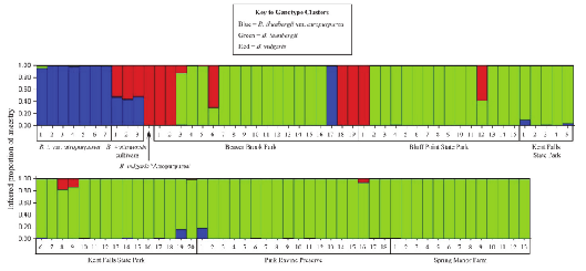
Having determined that the data support \(K=3\), the results of the analysis are displayed in Figure 1. Each vertical bar corresponds to an individual in the sample, and the proportion of each bar that is of a particular color tells us the posterior probability that the individual belongs to the cluster with that color.
Figure 1 may not look terribly informative, but actually it is. Look at the labels beneath the figure. You’ll see that with the exception of individual 17 from Beaver Brook Park, all the of the individuals that are solid blue are members of the cultivated Berberis thunbergii var. atropurpurea. The solid red bar corresponds to Berberis vulgaris ’Atropurpurea’, a different modern cultivar.10 You’ll notice that individuals 1, 2, 18, and 19 from Beaver Brook Park and individual 1 from Bluff Point State Park fall into the same genotypic cluster as this cultivar. Berberis \(\times\)ottawensis is a hybrid cultivar whose parents are Berberis thunbergii and Berberis vulgaris, so it makes sense that individuals of this cultivar would be half blue and half red. The solid green bars are feral individuals from long-established populations. Notice that the cultivars are distinct from all but a few of the individuals in the long-established feral populations, suggesting that contemporary cultivars are doing relatively little to maintain the invasion in areas where it is already established.
A much more interesting application of
Structure appeared a shortly after
Structure was introduced. The Human Genome
Diversity Cell Line Panel (HGDP-CEPH) consisted at the time of data from
1056 individuals in 52 geographic populations. Each individual was
genotyped at 377 autosomal loci. If those populations are grouped into 5
broad geographical regions (Africa, [Europe, the Middle East, and
Central/South Asia], East Asia, Oceania, and the Americas), we find that
about 93% of genetic variation is found within local populations and
only about 4% is a result of allele frequency differences between
regions .
You might wonder why Europe, the Middle East, and Central/South Asia
were grouped together for that analysis. The reason becomes clearer when
you look at a Structure analysis of the
data (Figure 2).
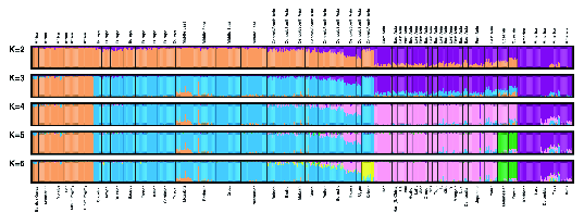
Structure analysis of
microsatellite diversity in the Human Genome Diversity Cell Line
Panel (from ).Structure has a lot of nice features, but
you’ll discover a couple of things about it if you begin to use it
seriously: (1) It often isn’t obvious what the “right”
K is.11 (2) It requires a
lot of computational resources, especially with
datasets that include a few thousand SNPs, as is becoming increasingly
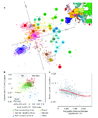
common. An alternative is to use principal component analysis directly
on genotypes. There are technical details associated with estimating the
principal components and interpreting them that we won’t discuss,12, but the results can be pretty
striking. Figure 3 shows the results of a PCA on data
derived from 3192 Europeans at 500,568 SNP loci. The correspondence
between the position of individuals in PCA space and geographical space
is remarkable.
Jombart et al. describe a related method known
as discriminant analysis of principal components. They also provide an
R package, dapc,
that implements the method. I prefer Structure
because its approach to individual assignment is based directly on
population genetic principles, and since computers are getting so
fast (especially when you have a computational cluster available) that I
worry less about how long it takes to run an analysis on large
datasets.13 That being said, Gopalan et
al.
released teraStructure about five years ago,
which can analyze data sets consisting of 10,000 individuals scored at a
million SNPs in less than 10 hours. I haven’t tried it myself, because I
haven’t had a large data set to try it on, but you should keep it in
mind if you collect SNP data on a large number of loci. Here are a
couple more alternatives to consider that I haven’t investigated
yet:
sNMF estimates individual admixture
coefficients. It is reportedly 10-30 faster than the likelihood based
ADMIXTURE, which is itself faster than
Structure. sNMF is
part of the R package
LEA.
Meisner and Albrecthsen present both a principal components method and an admixture method that accounts for sequencing errors inherent in low-coverage next generation DNA sequencing data.
These notes are licensed under the Creative Commons Attribution License. To view a copy of this license, visit or send a letter to Creative Commons, 559 Nathan Abbott Way, Stanford, California 94305, USA.